🌊 Channel-Level Deep-Dive
The channel-level deep dive tab has three sub-tabs: Channel Performance, Shift Curves, and Saturation Curves
Channel Performance
The channel performance section has one tab for each paid marketing channel your brand has spent money on in the last year. In this tab, we can see a few different views of how channel performance changes over time.
Each of these views has two time series lines on it. One line (in green) is the amount of spend which is simply shown for context. The other line is blue with a shaded region and is the time-series of the results found by Recast.
The views are :
ROI: This is the direct earned ROI for this channel for every day in the last 12 months. Note that the ROI is earned, not necessarily realized on that day.
Marginal ROI: This is the direct ROI of the last dollar invested into the channel on that day.
Impact: This is the direct effect earned on that day. It is just the ROI multiplied by the spend.
Impacted Shifted: This is the direct effect realized on that day. It is the impact after the time-delay schedule (”shift curves” in Recast parlance) has been applied.
Shift Curves
Shift curves show how long it takes for marketing to have its effect. Sometimes people use the term “adstock” which is technically a different functional form then what Recast uses but the idea is the same: the model is learning how long it takes for marketing spend to have its effect.
How to interpret the chart:
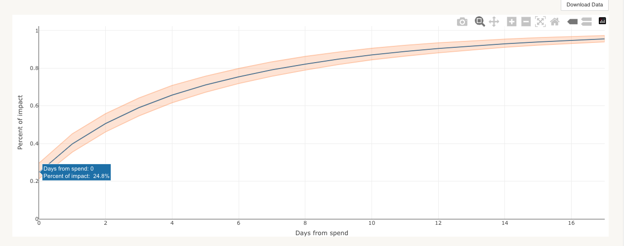
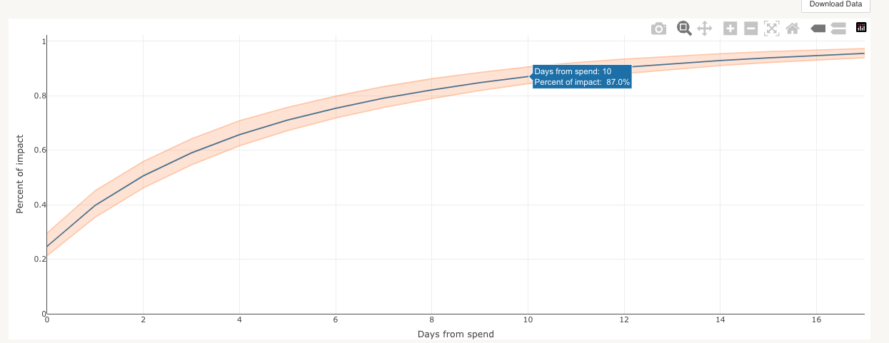
The horizontal axis is the number of days since the spend occurred
The vertical axis the percent of effect realized after N number of days since the spend occurred.
So, on the left side of the chart we can read off how much of the effect is realized on the same day the spend happens.

So if we spend $1,000 on this channel, and the channel has a total ROI of 2x, we expect to get 25% of $2,000 = $500 on the day the spend happens (day 0).
And then we can see on the chart what percent of effect is realized after any number of days. Here we can see that after 10 days we expect to realize 87% of the total effect.

Saturation Curves
Saturation curves show how Recast expects the ROI of a channel to change at different levels of spend. Sometimes these are referred to as “diminishing marginal returns” curves.
You can view each of these curves in different units, showing either the ROI, marginal ROI, or impact at different levels of daily spend.
By default, the curves all show the expected saturation as of the last day modeled, and those curves might change depending on seasonality or holiday or promo schedules.
Subchannel Performance
Recast allows you to split out a channel into multiple subchannels and generate an estimate of how the ROI differs between subchannels. Subchannels share other properties (shift, saturation, etc) with the channel they’re a part of, but we estimate a subchannel multiplier indicates whether the sub channel is more or less effective than the channel as a whole.
Subchannels are modeled as part of the channel. We additionally model a ROI multiplier that will tell us how much a campaign was more/less effective than the channel as a whole. The multiplier will generally be close to 1. The subchannels tab allows you to compare the performance of your subchannels with the performance of the channel in a graph.
Use cases
If you have a podcasts channel but want to also the measure effectiveness of spend for a particular podcast network within that entire channel (assuming the spend is non-negligible), you can add a sub-channel with your podcasts channel to measure the effectiveness of a specific network where you spend a percentage of your total podcast channel spend.
It also may be useful if you have multiple channels with less spend that we assume have similar shift/saturation properties. We can model them as a single channel and then break down the effectiveness of each subchannel without exploding the number of channels. For example, You can use subchannels to break out TV into different spot lengths or break out your paid social channels into brand and non-brand campaigns.
How to interpret the graphs/tables:
ROI over time
This graph shows the time series performance over time of the subchannel. The channel ROI is shown in gray as a reference point for the subchannel ROI. Subchannels can perform slightly better, worse or the same as the channel.
Spend over time
The spend over time graph shows how much was spent in each subchannel over time. This can be compared to the ROI over time graph to see the correlation between spend and ROI in the subchannels.
Average ROI
This table shows each subchannel, the average ROI for each sub channel and the ROI at each quartile. Using this you can see the average return on investment and the distribution of this estimate.
