🧑🏽‍🏫 Insights

Learn all about how to interpret the charts and graphs in the Recast Insights Dashboard.

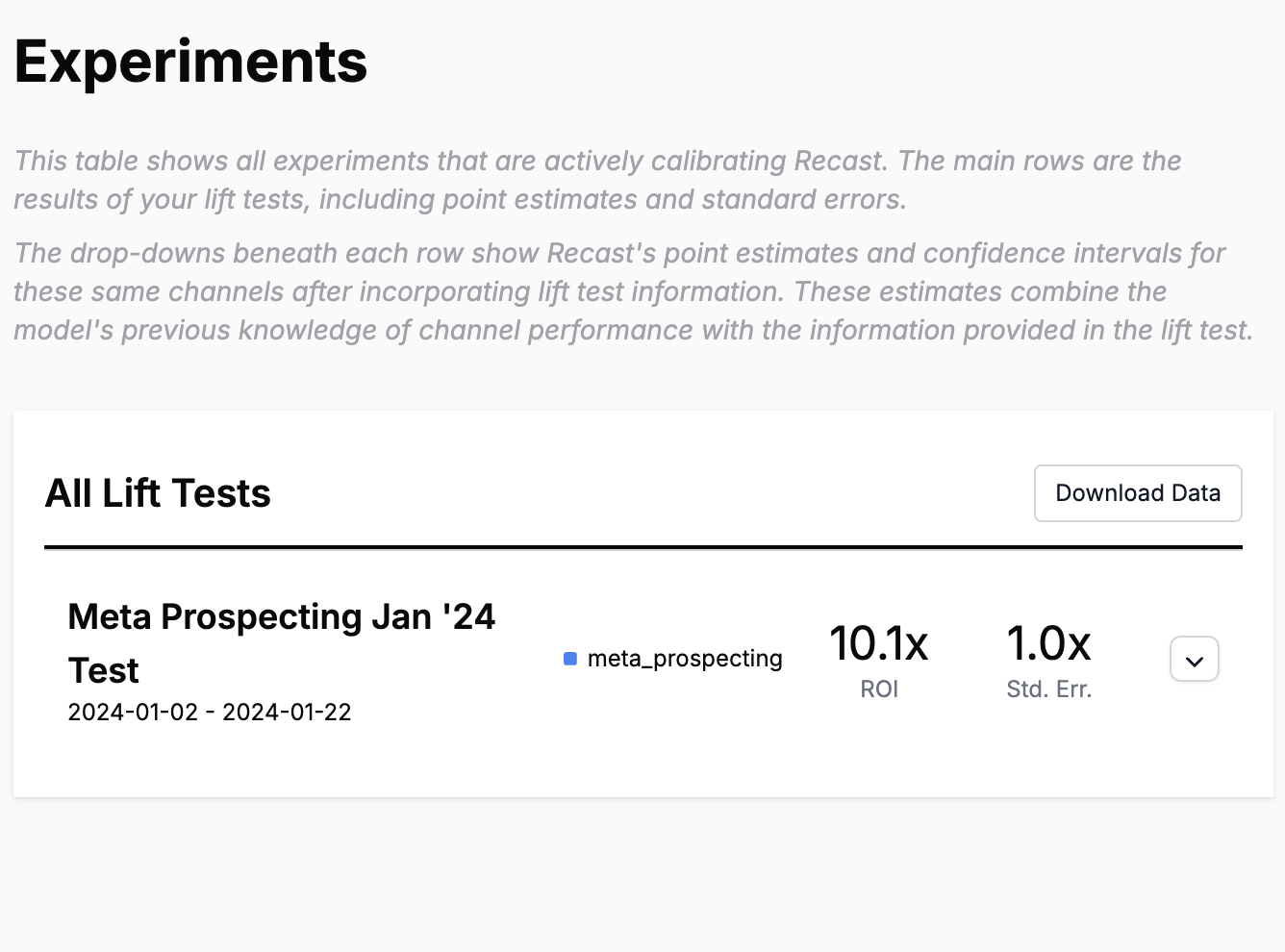
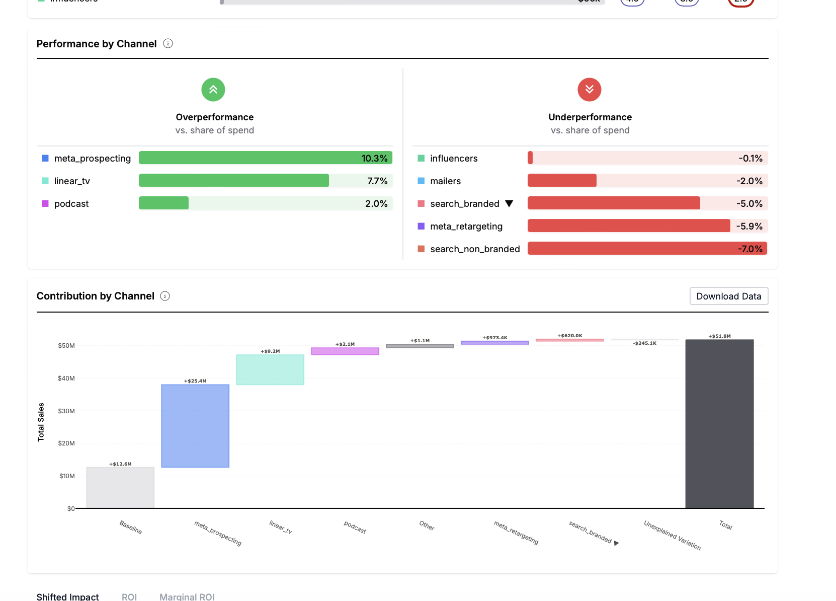
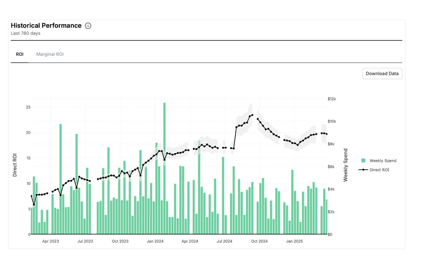
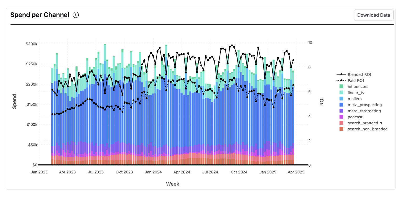
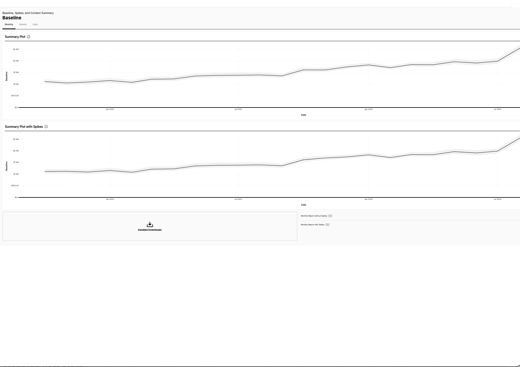
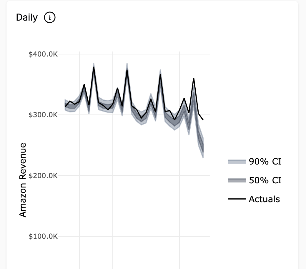
The first place many people start is on the Insights tab. The Insights tab tells us about what’s been happening in the past and shows the results of a statistical model trained on your company’s historical data.


💰Spend Summary

The spend summary tab shows some high-level statistics on your historical spend and business KPI over the last 12 months. This view is useful for:

  1. Understanding high-level patterns in the data
  2. Validating that there’s no data issues that might impact the model results

📷 Last Week Snapshot

This is probably the most important view on the insights tab. The last week snapshot view shows us a breakdown of channel performance over the last complete 7 days that the model has seen. You can see the last-complete-data-date in the top left-hand corner of the screen where it says “data through”.


Waterfall Plot

The waterfall plot shows a breakdown of your KPI in the last 7 days and how much each marketing channel contributed to that KPI (according to the statistical model).

Notes:

  • The “intercept” is all of the KPI that’s not attributed to marketing activity. Some marketers call this “base sales” or “organic”.
  • Spikes are things like promotional events, store closures, or new product launches. You can see more detail on the “Spike Summary” tab
  • “Unexplained Variation” is due to the random variation where sometimes the model estimates miss high or low. This should average out to zero over long time frames, but within a given week you may randomly have more (or less) unexplained variation just due to randomness.

Marketing Effectiveness

Here we see two charts side-by-side. The left-hand side just shows how much you spent on every marketing channel in the last week, and the right hand side shows the relative effectiveness of each channel. Longer bars are always better.

The blue bars show the ROI or CPA of all of the dollars invested in the channel over the time period. The red bars show the marginal ROI or CPA of the last dollar invested into the channel.

The marginal ROI will always be less than the average ROI due to diminishing returns. You can see each channel’s diminishing returns curve on the Channel-Level Deep Dive tab.

Note:

  • These are estimates of the total return earned (but not necessarily realized) in the last 7 days. The model expects that additional conversions will come in the future.
  • The lines on top of the bars represent uncertainty in the model and are showing the interquartile range of effectiveness estimates found by the model.

Share of Spend vs Share of Effect

This chart is a nice summary of which channels you’re most invested in versus which channels drive the most impact for your business. Channels where the % effect is higher than the % spend are relatively over-performing and channels where the % spend is higher than the % effect are relatively under-performing.


↕️ Lower Funnel Spend

The Lower Funnel Spend tab shows how your spend in certain marketing channels drives spend into channels in which you have less control over what you spend. Recast has a notion of “lower funnel channels” and “upper funnel channels”. This terminology likely doesn’t match your internal categorization of channels (and that’s okay!) but in Recast “lower funnel channels” are generally channels that are driven primarily by other channels. These are generally channels like “branded search” and “affiliates”.

The lower funnel spend section of the dashboard has a tab for each lower funnel channel and it shows a waterfall chart of what other marketing channels drove that spend. That is, it answers questions like “how much of our google branded search spend was driven by TV spend?”

The lower funnel channels also include an “intercept” which basically just includes all of the spend in that channel not driven by other marketing channels.


🌊 Channel-Level Deep-Dive

The channel-level deep dive tab has three sub-tabs: Channel Performance, Shift Curves, and Saturation Curves

Channel Performance

The channel performance section has one tab for each paid marketing channel your brand has spent money on in the last year. In this tab, we can see a few different views of how channel performance changes over time.

Each of these views has two time series lines on it. One line (in green) is the amount of spend which is simply shown for context. The other line is blue with a shaded region and is the time-series of the results found by Recast.

The views are:

  • ROI: What is the total earned ROI for this channel for every day in the last 12 months. Note that the ROI is earned, not necessarily realized on that day.
  • Marginal ROI: What is the ROI of the last dollar invested into the channel on that day.
  • Impact: This is the effect earned on that day. It is just the ROI multiplied by the spend.
  • Impacted Shifted: This is the effect realized on that day. It is the impact after the time-delay schedule (”shift curves” in Recast parlance) has been applied.

Shift Curves

Shift curves show how long it takes for marketing to have its effect. Sometimes people use the term “adstock” which is technically a different functional form then what Recast uses but the idea is the same: the model is learning how long it takes for marketing spend to have its effect.

How to interpret the chart:

  • The horizontal axis is the number of days since the spend occurred
  • The vertical axis the percent of effect realized after N number of days since the spend occurred.

So, on the left side of the chart we can read off how much of the effect is realized on the same day the spend happens.

So if we spend $1,000 on this channel, and the channel has a total ROI of 2x, we expect to get 25% of $2,000 = $500 on the day the spend happens (day 0).

And then we can see on the chart what percent of effect is realized after any number of days. Here we can see that after 10 days we expect to realize 87% of the total effect.

Saturation Curves

Saturation curves show how Recast expects the ROI of a channel to change at different levels of spend. Sometimes these are referred to as “diminishing marginal returns” curves.

You can view each of these curves in different units, showing either the ROI, marginal ROI, or total impact at different levels of daily spend.

📘

By default, the curves all show the expected saturation as of the last day modeled, and those curves might change depending on seasonality or holiday or promo schedules.

Subchannel Performance

Recast allows you to split out a channel into multiple subchannels and generate an estimate of how the ROI differs between subchannels. Subchannels share other properties (shift, saturation, etc) with the channel they’re a part of, but we estimate a subchannel multiplier indicates whether the sub channel is more or less effective than the channel as a whole.

Subchannels are modeled as part of the channel. We additionally model a ROI multiplier that will tell us how much a campaign was more/less effective than the channel as a whole. The multiplier will generally be close to 1. The subchannels tab allows you to compare the performance of your subchannels with the performance of the channel in a graph.

Use cases

If you have a podcasts channel but want to also the measure effectiveness of spend for a particular podcast network within that entire channel (assuming the spend is non-negligible), you can add a sub-channel with your podcasts channel to measure the effectiveness of a specific network where you spend a percentage of your total podcast channel spend.

It also may be useful if you have multiple channels with less spend that we assume have similar shift/saturation properties. We can model them as a single channel and then break down the effectiveness of each subchannel without exploding the number of channels. For example, You can use subchannels to break out TV into different spot lengths or break out your paid social channels into brand and non-brand campaigns.

How to interpret the graphs/tables:

ROI over time
This graph shows the time series performance over time of the subchannel. The channel ROI is shown in gray as a reference point for the subchannel ROI. Subchannels can perform slightly better, worse or the same as the channel.

Spend over time
The spend over time graph shows how much was spent in each subchannel over time. This can be compared to the ROI over time graph to see the correlation between spend and ROI in the subchannels.

Average ROI
This table shows each subchannel, the average ROI for each sub channel and the ROI at each quartile. Using this you can see the average return on investment and the distribution of this estimate.


🌾 Intercept

The “intercept” shows you your brand’s “baseline” sales. That is, how many sales would you have in the absence of any marketing activity (or at least the marketing activity included in your Recast model). You can view the intercept on its own or you can view the intercept combined with the “spikes” (holidays, promo events, etc) all in one chart.


✳️ Spike Summary

“Spikes” includes information about certain promotional events that are included in your Recast model. These types of events are generally things like:

  • Time-limited promotional or discounting events (e.g., 20% off Memorial day sale)
  • Holidays (BFCM, Christmas, New Years, Mother’s Day, etc.)
  • Other important events (conference day, partner email blast, etc.)

The Recast model shows the true full impact of a spike over time. This might include positive effects on the day of the spike, but then negative effects before and after due to “pull forward” or “pull backward” effects. You can compare the size and shape of these effects directly in the tool:


🖼️ Context summary

The Context Summary is a useful tool for companies who have models with additional factors affecting their marketing outcomes. For example, if you find that after a price change or new offer, your sales are performing differently, our model will be able to measure these changes.

You can use these graphs for answer questions like:

  • What is the impact of brand awareness on my marketing effectiveness?
  • We are planning to increase the price of our offering. How is this expected to impact my marketing effectiveness?

The context summary shows the range of estimated effect of your context variable on your marketing effectiveness.

❗️

Contextual metrics must be pre-configured in your Recast model before the report will be available

Interpreting the Graphs

The first graph in this report is the Effect of Contextual Metrics graph. For each of your contextual metrics, this tells you how much your marketing effectiveness will change with a change in your context variables.

For example, the graph below tells us that a 5 point increase in brand awareness is expected to lead to an increase in marketing effectiveness between 8.8%-11.7%.

For each context variable, you can see the impact of changes on both the paid and baseline effectiveness. 


The next graph is the variable over time graph. This tells us how much your context variable has changed over time.  In the graph below, we can see that the price decreased in May 2023 from $160 to $155. You can use this information to provide context to any changes you see during this time in your marketing effectiveness.

For each contextual metric, you can see the impact of changes on both the paid and baseline effectiveness.

The next graph is the variable over time graph. This tells us how much your contextual metric has changed over time. In the graph below, we can see that the price decreased in May 2023 from $160 to $155. You can use this information to provide context to any changes you see during this time in your marketing effectiveness.

Use the hoverover to find the value of your context variable on a specific date.

Use the hoverover to find the value of your context variable on a specific date.

The final graph is the effect over time graph. This shows us the effect of the contextual metric on marketing effectiveness over time.

In the graph below you can see that when there was a price change in May 2023, the organic effectiveness fell from 103% to 100%.

To use the two graphs together:

  1. Identify the time period when there was a change in the contextual metric using the first graph.
  2. Look at the same time period in the second graph to see the the effect of the change on marketing effectiveness.

⬅️ Backtests

The backtests tab is probably the most important tab in the entire Recast platform. The backtests tab helps us understand how well your Recast model does at predicting the future on data the model has never seen before. We believe this is the most important way to evaluate the accuracy of an MMM model.

The way the Recast backtests tab works is that it shows you how well models trained on data in the past do at predicting the future. So if we trained a model 60 days ago, how well does that model do at predicting the next 60 days (data that we now have, but that the model never saw).

↪️ Prior vs Posterior

The Prior vs Posterior tab shows you a comparison between the model’s time shift and intercept priors and the posteriors. This helps you to see how your initial assumptions about your business compare to Recast’s measurement.

What is the posterior?

The posterior is the calculated estimate the model makes based on your past spend and return data. These include estimates of the intercept and timeshifts (channel ROI coming soon).

How to use the Prior vs Posterior report?

This is useful to help you check your assumptions about the effects of your marketing spend. It can help you visualize where the data disagrees particularly strongly with your prior estimates, and can be useful in identifying areas where revisiting the priors may be helpful.


🧪 Experiments

The experiments page displays a list of the lift tests Recast has ingested into your model. Lift tests are a great way to improve your MMM by incorporating extra information. Use the Experiments page to see the lift tests you’ve ran and see how the Recast model is incorporating the experiments into its estimates

If you have any experiments you would like to include in your Recast model, please speak with the Recast Data Scientist working with your team. They will help ingest the experiment data into your model. You will need to provide:

  • The channel the test applied to
  • The dates the test ran
  • The point estimate and the standard error (or confidence interval) of the test

You can compare Recasts estimates to the results of your test using the dropdown arrow on the right of the lift test bar. Recasts estimates are for the same channel and time period of your lift test. The Recast estimate combines information from the experiment with your MMM model for a more precise estimate. Lift tests can provide narrower confidence intervals than the MMM estimates on their own.

This will show you the channel efficiency estimated by Recast as well as the confidence interval.

This will show you the channel efficiency estimated by Recast as well as the confidence interval.

If you do not have any lift tests yet but are interested in calibrating your model, our Recast Data Scientists can help you set up a test using GeoLift by Recast (Beta).


📡 Data Concerns

The data concerns tab helps you see if there are any data issues that may impact the read of your model. Every week Recast ingests your latest data and refreshes the model. If the model detects any issues, you will receive an email alerting you of this so that you have the opportunity to correct any errors.

This tab contains:

  • A table of all the errors and warnings regarding your latest refresh
  • A table of the date through which your model was last refreshed, the date through which your model was most recently refreshed
  • A table of all the rows in your dataset with revisions to the channel spend

If you see any errors, this will stop your model from running until you are able to correct the errors detected. Warnings will not stop your refresh but may impact the read you get from the model. Recast recommends you flag any issues with your internal point of contact for data. Once you have corrected your data, you can head to the refresh tracker to schedule a new refresh.

Some common issues and how to resolve them are:

Historical revisions in channel spend: This means that there were changes to the amount you reported to spend in a channel. Recast received spend data that when compared to a previous data set, was different. This could mean that we initially received incomplete data or that some of your data is missing.

_Historical revisions in KPI: _This means that with the new data ingest, there were changes to the KPI you reported compared to your previous data ingest. This could mean that we initially received incomplete data or that some of your data is missing. Ex. You reclassified how you report “returns” in your sales data, causing historical data to change

Unusually low KPI values: This means that the KPI we are modeling looks suspiciously low during the period of the new data. This could be because all your data wasn’t fully in. Ex. sales from Target were reported but sales from Walmart were missing.

Critical errors that will cause your refresh to fail include:
Missing data for certain dates
Duplicate dates detected
Recent data is not newer than historical data

Date Ranges for Model Data
This box shows you a breakdown of when the data was last refreshed, what date the current refresh's data is through, and what date the prior refresh's data was through. You can use this to check that your model will be updated through the day you expect. Using the tabs you can toggle between these dates for each of your models.

Historical revisions detected in channel spend
Finally, you can see a table of all the revisions in channel spend detected in your most recent dataset that you provided for your most recent refresh. This table shows the date on which the data is different from the previous dataset, the channel for which spend was different, the previous spend reported, the currently reported spend and the difference between the two. This can help you identify what is causing the revisions in your data.

Sometimes, the current data is correct. In this case, just keep an eye out for potential ways in which this could impact your previous forecasts or optimizations as these might have under or over predicted due to the previously incorrect data.

📘

The data table will report ALL historical changes for reference, but only changes >$1000 trigger the warning.

How to resolve data issues

Before you click the refresh button or schedule your refresh, make sure that your data does not have any data quality issues. Data quality issues can cause model instability. To check for any issues:

Check the problematic data points indicated in the table
Check to make sure you uploaded a complete dataset
Dig into why you may be seeing historical revisions by looking for data entry errors or delays in when data comes from your vendors.


❓Insights FAQs

What is the unexplained variation on the waterfall chart?

The simple linear regression formula you may have learned in school is: y = x_slope + residual error. Our model is like a really complicated regression. It produces a prediction for your sales in the last seven days, and the difference between the prediction (x_slope) and what actually happened (y) is the residual error, which is what we show in the waterfall chart.

The unexplained variation number will change every week because it’s just a random deviation specific to that week. One week sales may be a little higher than our prediction, the next week a little lower. Over the long run, the average of these deviations should be close to zero (you’ll have as many positive residuals as negative). The unexplained variation is not a measure of how confident we are in any particular channel (we provide confidence intervals for that), and it’s not a prediction of how far off the model will be in the future (we recommend the forecaster to see how big the range of possible outcomes is for a given scenario).

Can you give me an overview of the interpretation of the dashboard?

We sure can!

How do we interpret the intercept chart?

What does the intercept mean?

📘

If you turned off all your marketing spend, and then waited for all the effect of your marketing spend to wear off (e.g. 3 months) how much of your business would still remain?

The intercept can be thought of as the amount of revenue (or conversions for a customer acquisition model) not attributable to marketing efforts.

It is often called “organic” although that can mean different things in different organizations so we avoid the term.

What is reflected in the intercept?

The intercept varies over time, so it can capture the effect of actions you take outside of marketing. For example, if you release a popular new product that brings lots of new customers, the intercept will trend up. If you introduce new email outreach programs that are successful, that will also be reflected in the estimate of the intercept.

We’re often asked if “word of mouth” is included in the intercept, and that depends on some of the details of your business. The ROI estimates Recast provides are estimates of true incrementality (how many additional sales would you have lost if you didn’t spend this money?). For some marketing efforts, the advertisement causes the person to purchase your product, and then they tell their friend who also purchases the product. This means that if the marketing spend was absent two customers would have been lost, so the incremental benefit was two new customers. To the extent possible, Recast will attribute these to the marketing channel ROIs; however, if the time lapse between the person who was driven by marketing and the person who purchased by word of mouth is large, the model will be unable to identify the causal link back to the marketing channel, and the intercept will absorb that effect.

❓Have a question not covered here? Email us at [email protected].