
In the Reporter tab, the reports available for you to run are similar to what you have seen in the Insights tab (such as the Overview, Intercept Summary etc) however, you can make your own customizations to the input parameters.
Recurring Reports vs One Time Reports
When you are creating a new report, you can select to create a one-off report or automatically update the report every time the model updates.
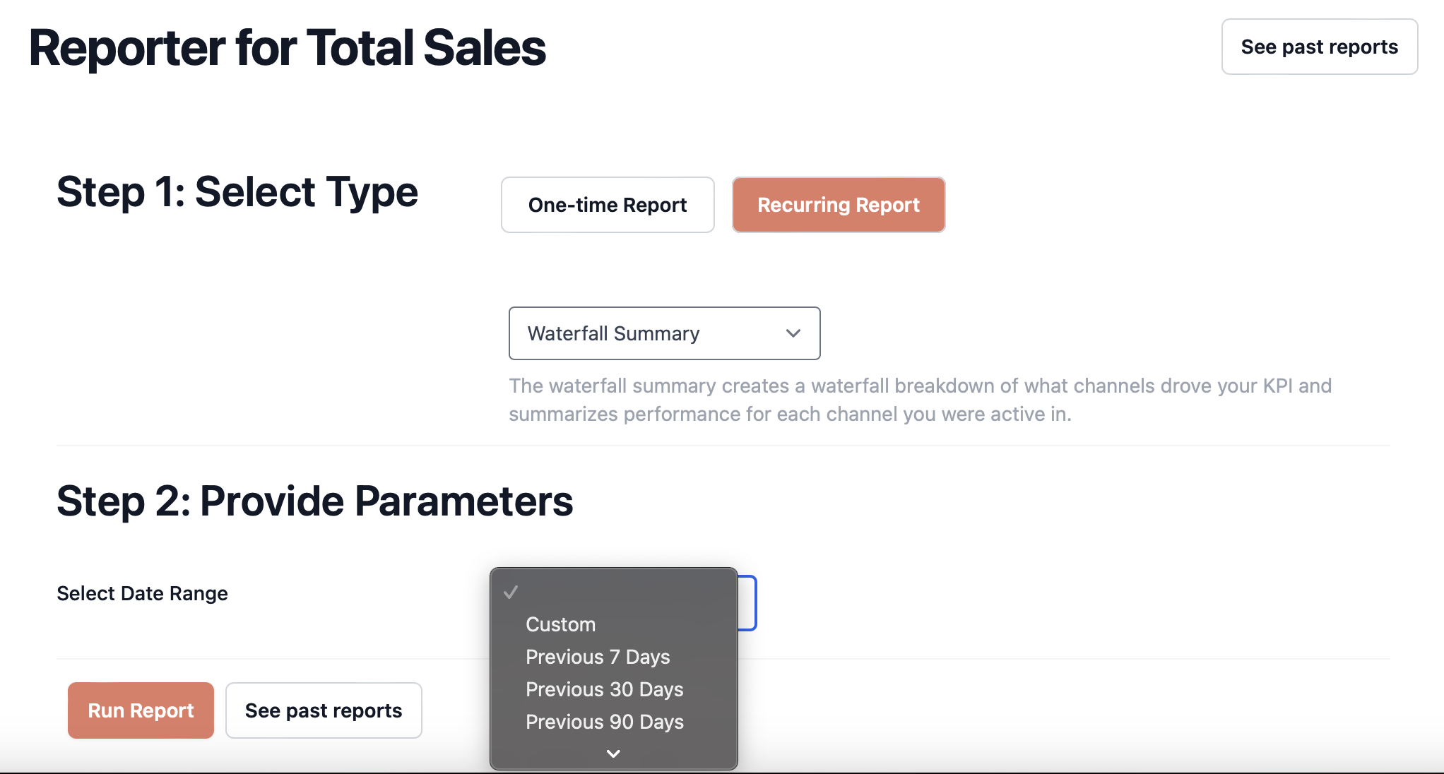
Step 1: Navigate to the Reporter
Step 2: Select "Recurring Reports"
Step 3: Select your report type
Step 4: Fill in the information required for the report type.
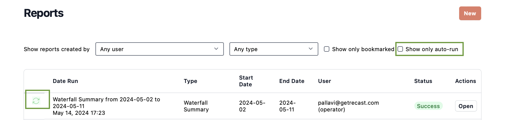
To see your recurring reports, click the check box next to "Show only auto-run" in the report library. Recurring reports will be marked with the ♻️ symbol for easy identification.
What happens to the selected date range?
Depending on your selection of date range, the recurring report will automatically generate either at every model refresh or when the model has complete date for the time period. For date range selections that are relative to the last date of data on the model, each time the model refreshes, the dates will shift to be relative to the new last date of data.
For the selections "Last month, quarter or year", the report will automatically generate when the model has data for the entire period specified.
For the custom selection, if the new model date is n days in the future compared to the date of the last model refresh, then all report dates will be shifted by n days. The next time the model is refreshed, all the report dates will be shifted by the number of days between the last model refresh and the latest model refresh.
For the “Fixed to Rolling” selection, the start date will remain fixed while the end date will shift by the number of days between the new old model refresh and the new model refresh.
You can use this feature to set up reports that will automatically generate for a given time period so every time the model updates, you can log into your dashboard and view the latest numbers in your report.
Report Types
Insights Overview
This report shows the same information as the Overview page in the Insights tab. It contains four graphs.
Outcome & ROI
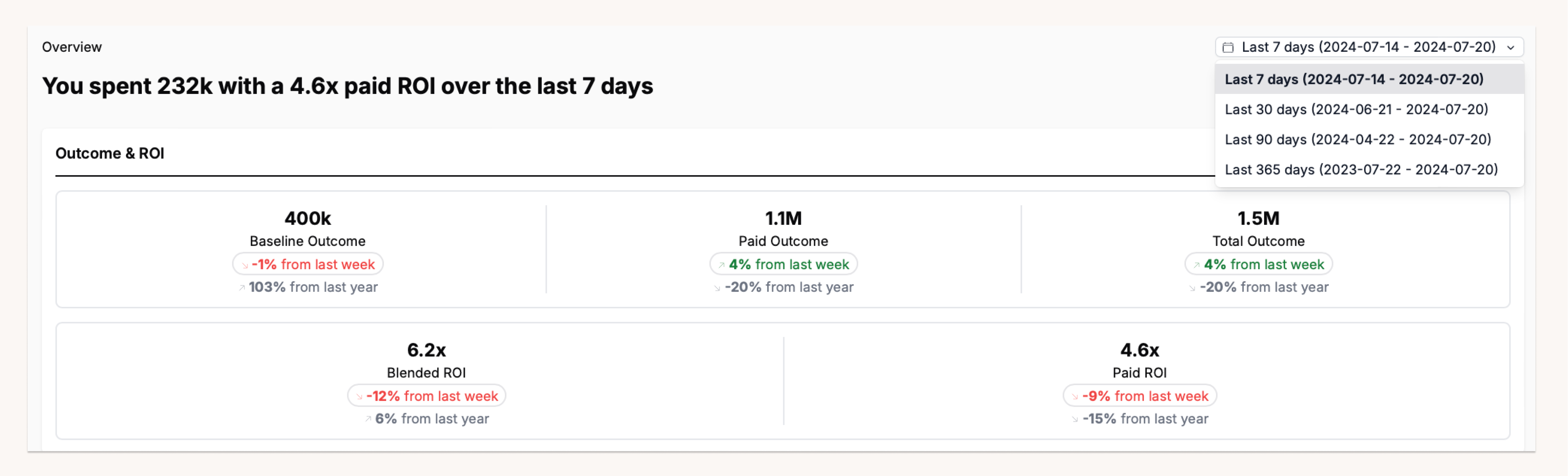
In the Outcome & ROI box you will see high level metrics as well as the change in each of the reported metrics comparing this period to last period, and this period to the same time last year. The metrics are:
-
Baseline Outcome: This is the estimated outcome gained in the period independent of your marketing spend from organic conversions and spikes (promotions and holidays).
-
Paid Outcome: This is the estimated outcome gained in the period as a result of your paid media spend.
-
Total Outcome: This is the total of your KPI observed in the period (not estimated)
-
Blended ROI/CPA: This is the total return on investment calculated as Total Outcome/Spend (not estimated)
-
Paid ROI/CPA: This is the estimated return on investment of your in-period paid media spend (regardless of when the outcome is realized).
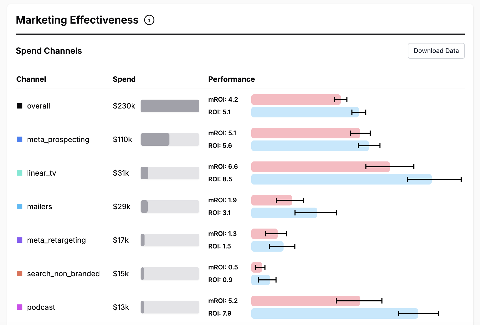
Marketing Effectiveness
The grey bars show the spend in each of your channels throughout the selected time period while the colored bars show as the ROI, MROI and Uncertainty associated with each channel.
Notes:
-
The ROIs/CPAs shown are "total" ROIs/CPAs, meaning that we calculate both the predicted lower funnel spend caused by the upper funnel spend and the predicted lower funnel effect of the lower funnel spend and use these to adjust the estimate to more accurately reflect the total impact of the spend. For lower funnel channels, no additional adjustment is necessary.
-
The CI Width is the width of the interquartile range of the Bayesian confidence interval on the ROI for ROI models. For CPA models, the CI width is the interquartile range for the number of acquisitions per $1000 spent in the channel. We report confidence interval widths on the ROI scale because it helps us avoid problems with CPA uncertainty expanding as CPAs increase. For example, if your overall CPA was $100, and one particularly bad channel had a CPA estimate of $2000-$2500, the CI width ($500), doesn't properly convey the model's high confidence that the channel is not performant. By reporting widths on the ROI scale, we properly convey that we have high confidence in the poor performance.
-
These are estimates based on the total return earned (but not necessarily realized) in time period. The model expects that additional conversions will come in the future.
-
The marginal ROI will always be less than the average ROI due to diminishing returns. You can see each channel’s diminishing returns curve on the Channel-Level Deep Dive tab.
-
The "▼" symbol represents channels that are configured as Lower Funnel Channels, which are configured differently within the Recast platform. More details are available on Lower Funnel Channels.
-
Downloads for all the confidence intervals are available at the bottom of the page.
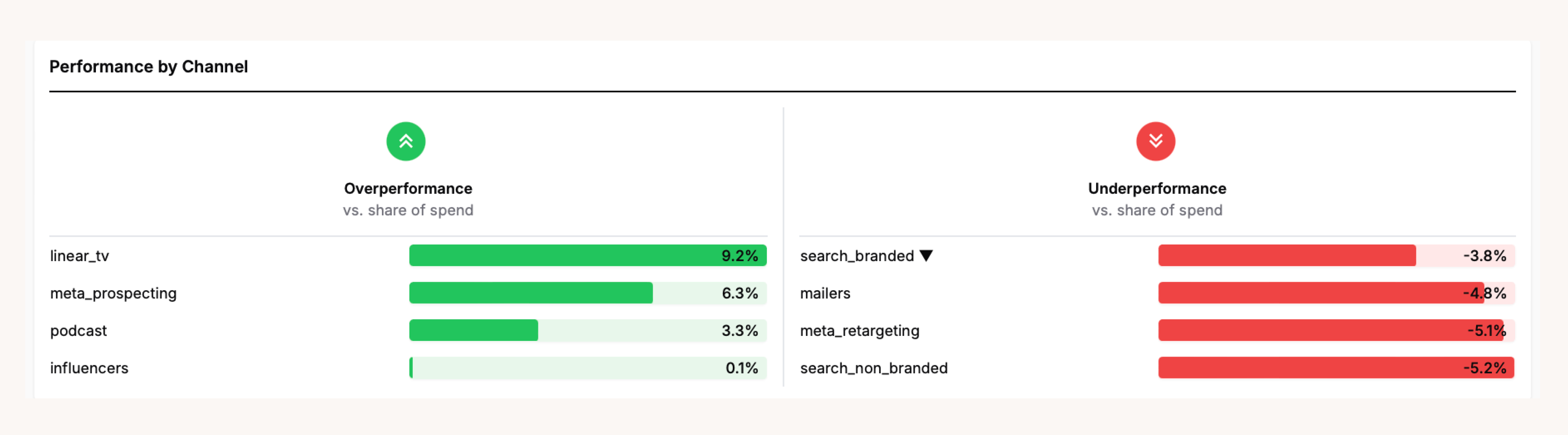
Performance by Channel
This graph shows the channels that a have relatively high or low share of effect compared to the share of spend. Share of spend is calculated by dividing the channel's spend by the total spend in the time period. Share of effect is calculated by dividing the estimated impact of the spend by the estimated impact of all other channels. The percentage shown on the graph is share of effect - share of spend.
Channels that represent a large portion of the total spend compared with the amount of KPI they are driving are considered ‘underperforming’ channels
Channel that represent a smaller portion of the total spend compared with the amount of KPI they are driving present outsized returns and are considered “over-performing’ channels.
Use this graph alongside the Marketing effectiveness graph to identify channels to further explore as potential places where there is an opportunity to increase or decrease spend to improve your overall performance.
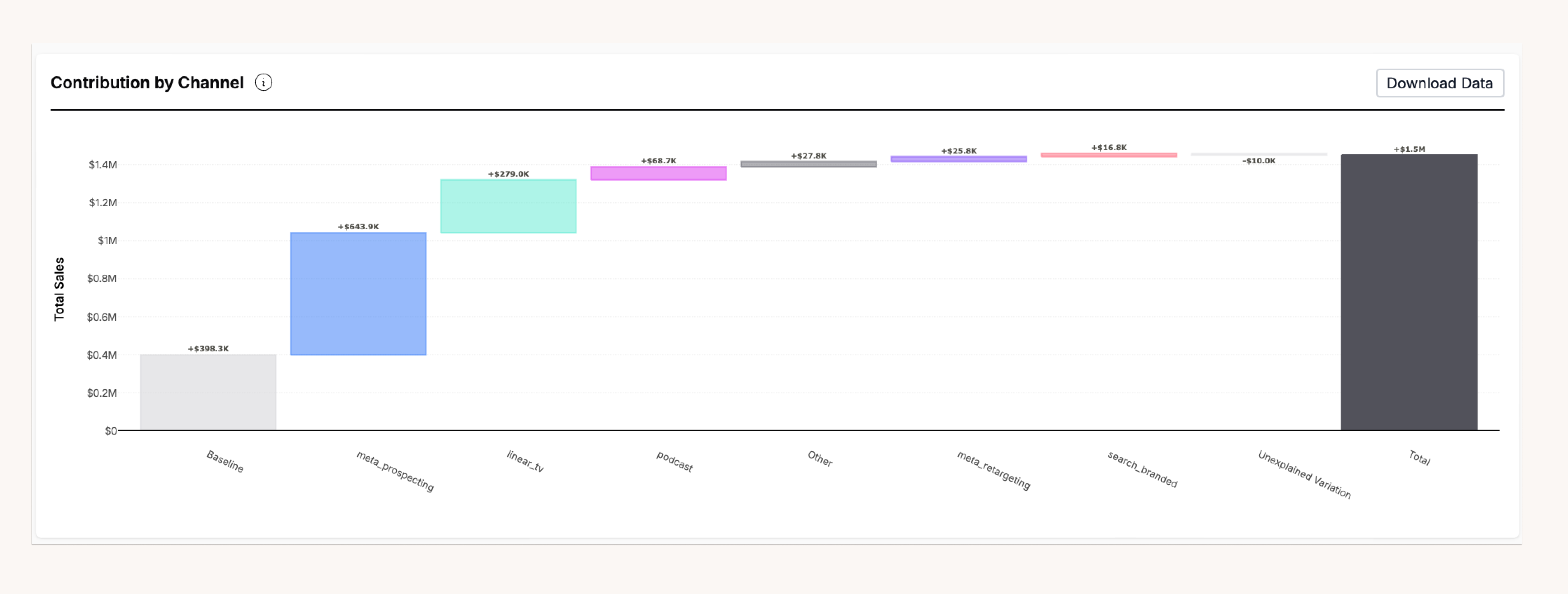
Contribution by Channel
The graph shows a breakdown of your KPI during the timeframe and how much each marketing channel contributed to that KPI based on the Recast model.
Notes:
-
The Baseline is all of the KPI that’s attributed to non-marketing, organic sales.
-
Spikes are things like promotional events, store closures, or new product launches. You can see more detail on the “Spike Summary” tab.
-
“Unexplained Variation” is due to the random variation where sometimes the model estimates miss high or low. This should average out to zero over long time frames, but within a given week you may randomly have more (or less) unexplained variation just due to randomness.
-
Channels contributing a small percentage of the total will be grouped into an "Other" channel.
To learn more about each of these graphs visit Overview in the Insights section
Baseline summary
The baseline summary shows the non-marketing (organic or “base sales”) portion of your business in a specified time period. That is, how many sales would you have in the absence of any marketing activity (or at least the marketing activity included in your Recast model). You can choose whether to include spike effects (holidays, promotions, etc) or not. This report can be run into the future to see the changes in the forecasted intercept.
The graphs in this report are line graphs showing the monthly and weekly changes in the baseline
throughout your reporting period. Hover over the line to view the mean, median and range of the intercept during a particular week or month.
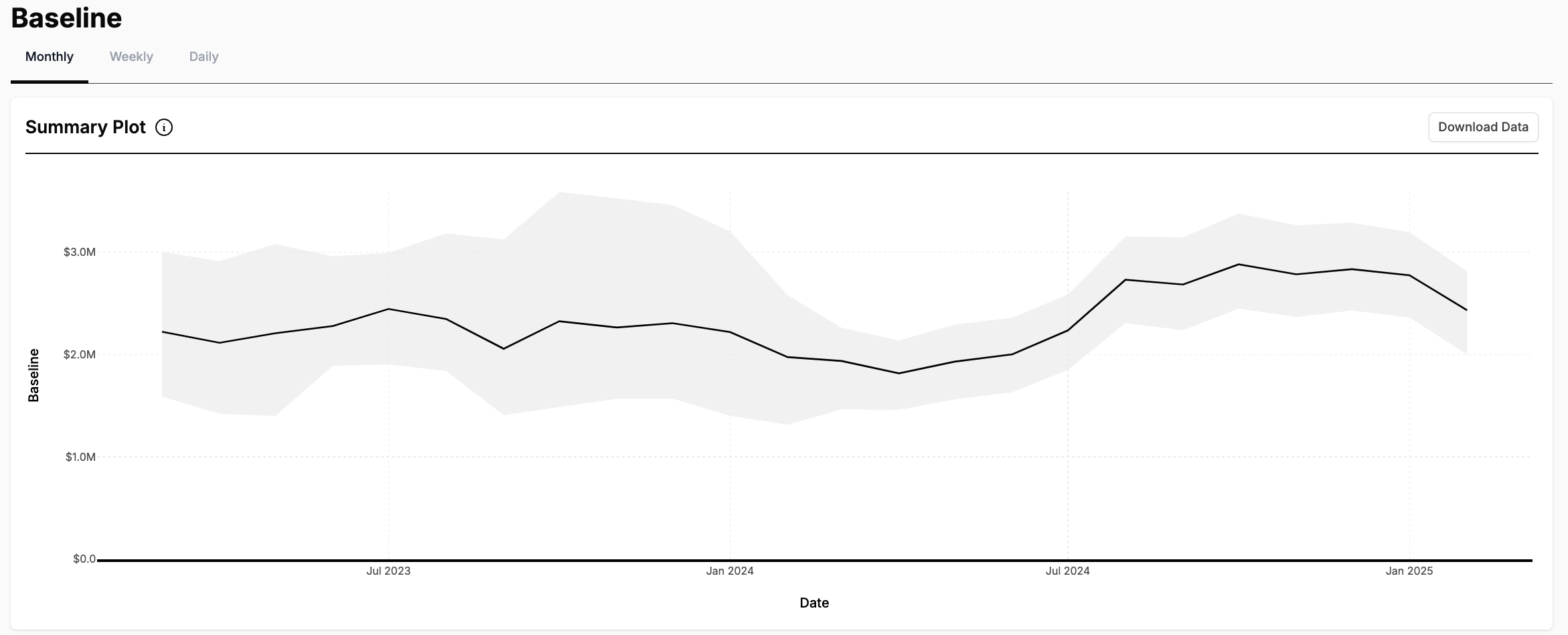
This report also contains a summary plot showing the daily intercept value every 7 days in the reporting period.
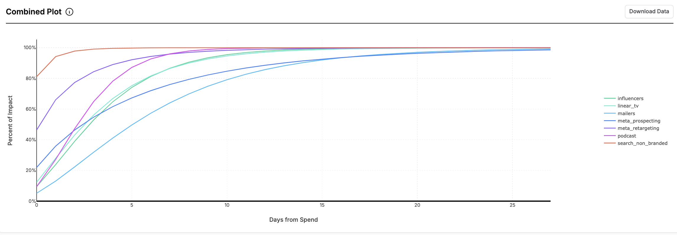
Shift curves
The shift curve report shows the estimated time it takes between when marketing activity happens in a channel (generally when money is spent) and when the effect of that activity is realized (e.g., in terms of conversions or revenue), for any channels you specify.
The day when marketing activity takes place is day 0
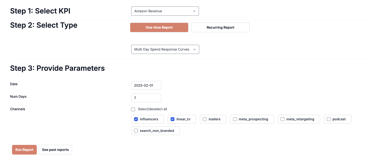
Spend Response Curves Report
Using the Spend Response Curves Report, you can find the expected return over a range of spend spread across your selected number of days.
Inputs & Outputs
Inputs:
-
Date Selection: Select the date for which you would like to create the saturation curve. This is the date the report will use for the performance and saturation parameters (betas and kappas) as well as the recent spend patterns.
-
Num Days: Select the number of days over which you would like to spread your spend.
-
Channel Selection: Select the channels to evaluate.
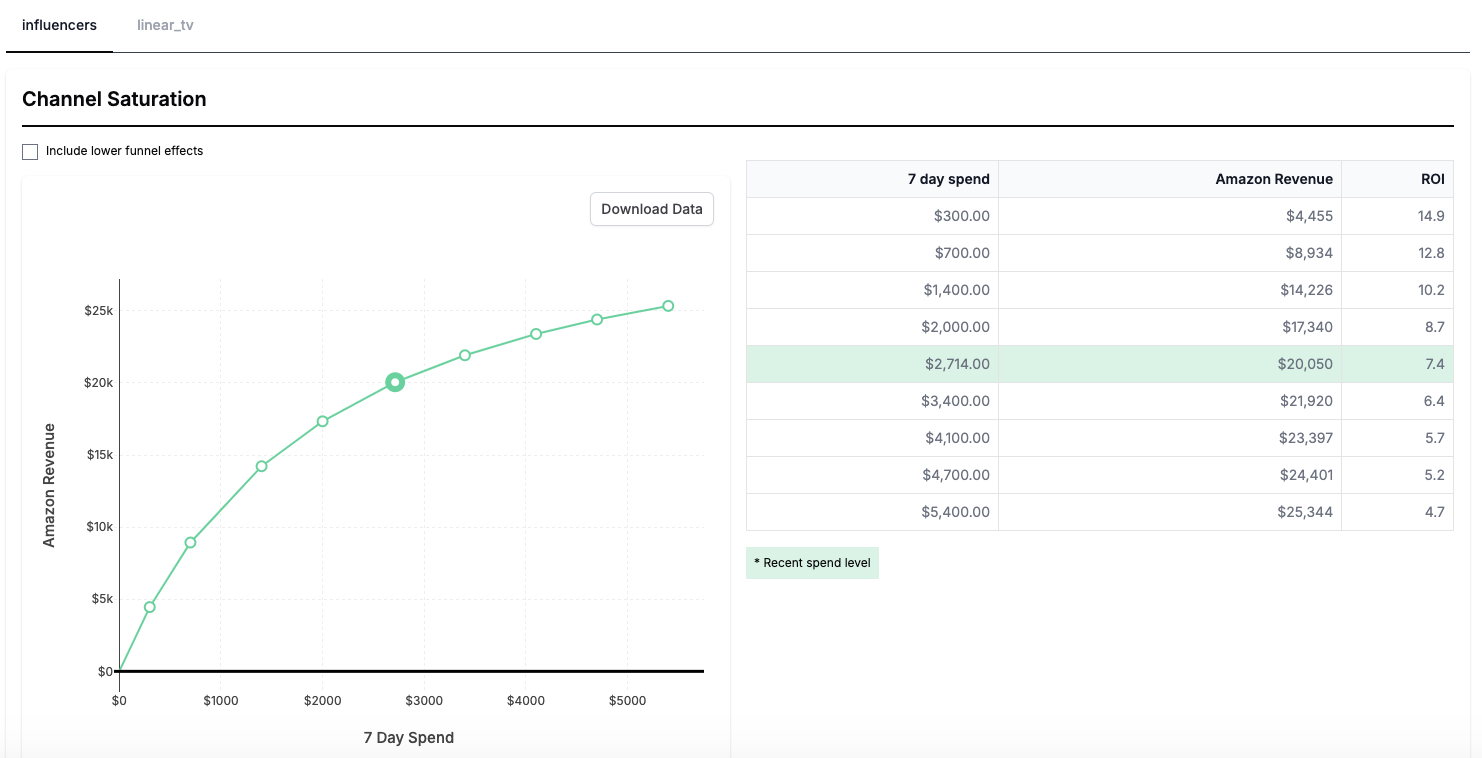
Outputs:
-
Saturation Curve: The points on the saturation curve are chosen using the amount you spent historically in the number of days leading up to the date you specified. For example, if you selected to spread your spend over 7 days and spend $100,000 in the 7 days leading up to the date you selected, the spend response will be evaluated at $100,000 and proportions of this value (.1, .25, .5, .75, 1.25, 1.5, 2).
-
Table Output: Impact and ROI calculations for the proportions of historical spend. The highlighted value is your actual historical spend over the selected period.
How It Works
-
The report retrieves the actual spend for the selected lookback period. If no recent spend exists, the report displays a $0 spend row, and uses the most recent lookback period that had spend for the other points.
-
The model applies historical spending patterns and saturation parameters (betas and kappas) from the date you specified. If the date is in the future, the curves uses the saturation parameters from the last model date.
-
The report estimates impact and ROI for each spend level.
Notes:
-
The report assumes spending patterns follow historical allocation patterns, rather than allocating all spend on a single day or spreading it evenly.
-
The results use the date specified to determine the saturation over the entire spend period (lookback window).
Use Cases
✅ Understanding how channels saturate over non-daily spend periods
✅ Identifying channels with significant scaling potential.
Not a Use Case
❌ Predicting long-term future performance.
❌ Budget planning.
❌ Measuring seasonal effectiveness.
Other Recast tools to use in conjunction:
-
For Long-Term Forecasting: Use Recast’s Forecaster tool.
-
For Historical Performance: Use the Period Summary Report or the Channel Performance Report.
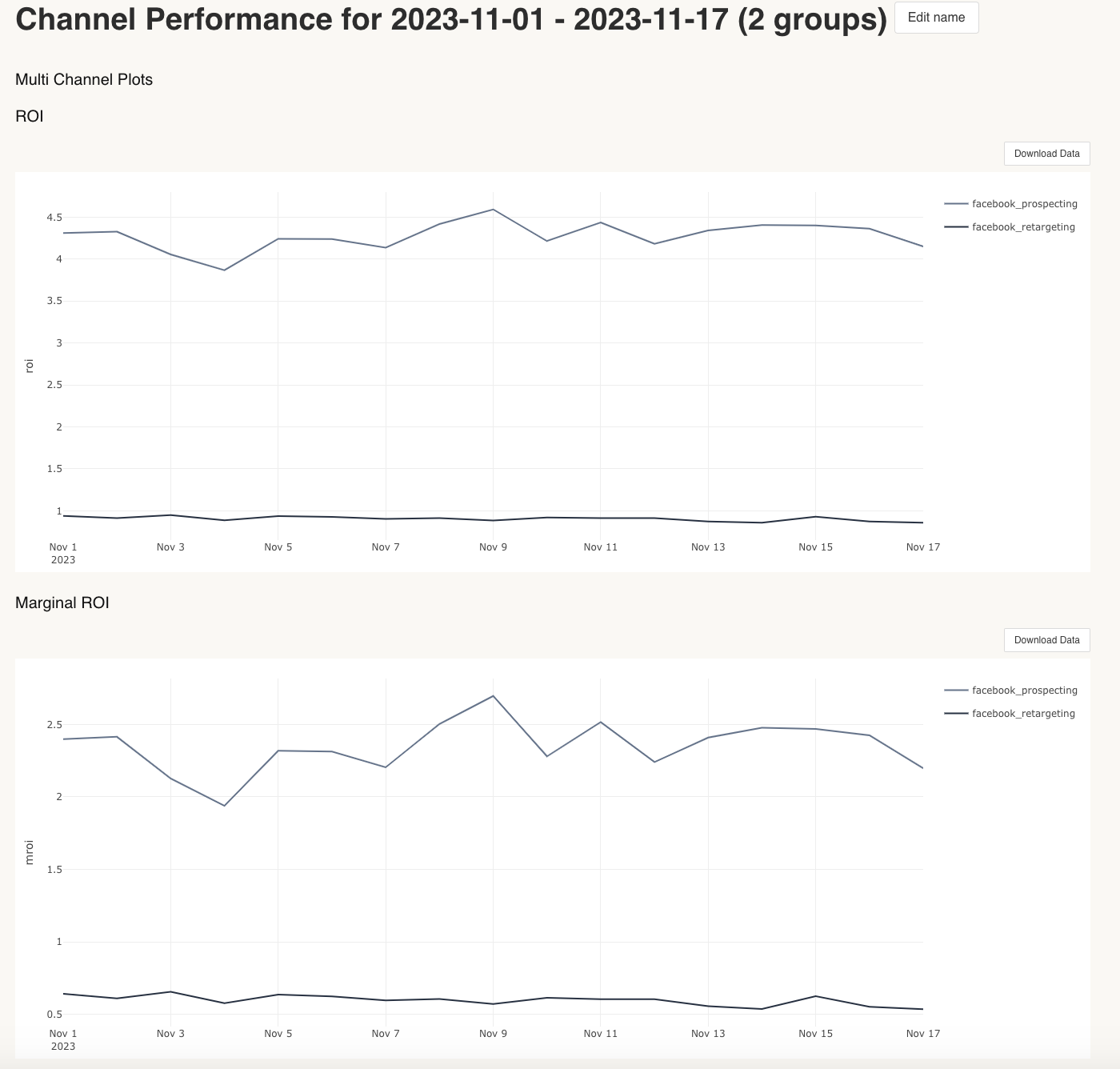
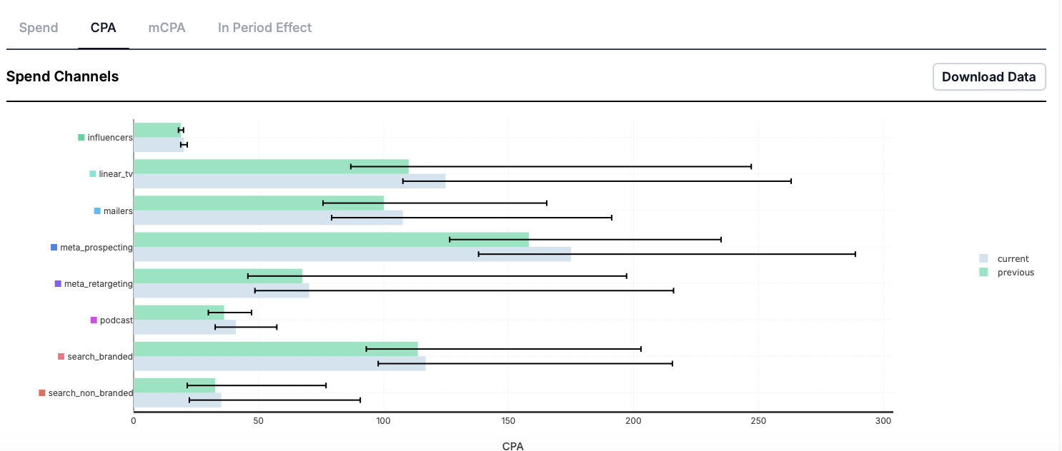
Channel performance
In this report, you can view performance over a specified amount of time, outside of the last twelve months view in the channel performance tab in the Insights dashboard.
What inputs are needed for the report?
The inputs needed are start date and end date for the reporting period. You can also select individual channels, aggregate channels or view all channels configured in the model within this report. You also can select to include lower funnel effects. Including lower funnel effects shows the full effect of the upper funnel spend by estimating the amount and performance of lower funnel spend and adjusting the ROI to reflect that contribution. To estimate only the direct effects of a channel, do not include lower funnel effects.
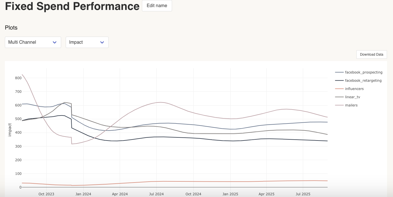
Fixed spend performance
The fixed spend performance report estimates the performance of a channel at a certain level of spend. The performance for the selected channel can be estimated for up to 730 days into the future, or in the past.
What inputs are needed for the report?
You can run the report for multiple channels or for a specific channel. The only other input needed to run the report is the amount of spend for the channel, or for the channels you want to review. We generally find it useful to input a small level of spend for the channel you want to review, in order to see the baseline efficacy before any saturation takes place (e.g. $1).
What can you review when the report is run?
When looking at the plot, you can review by multi channel or individual channel, as well as by impact, as well as ROI and MROI or CPA MCPA, depending on your model KPI.
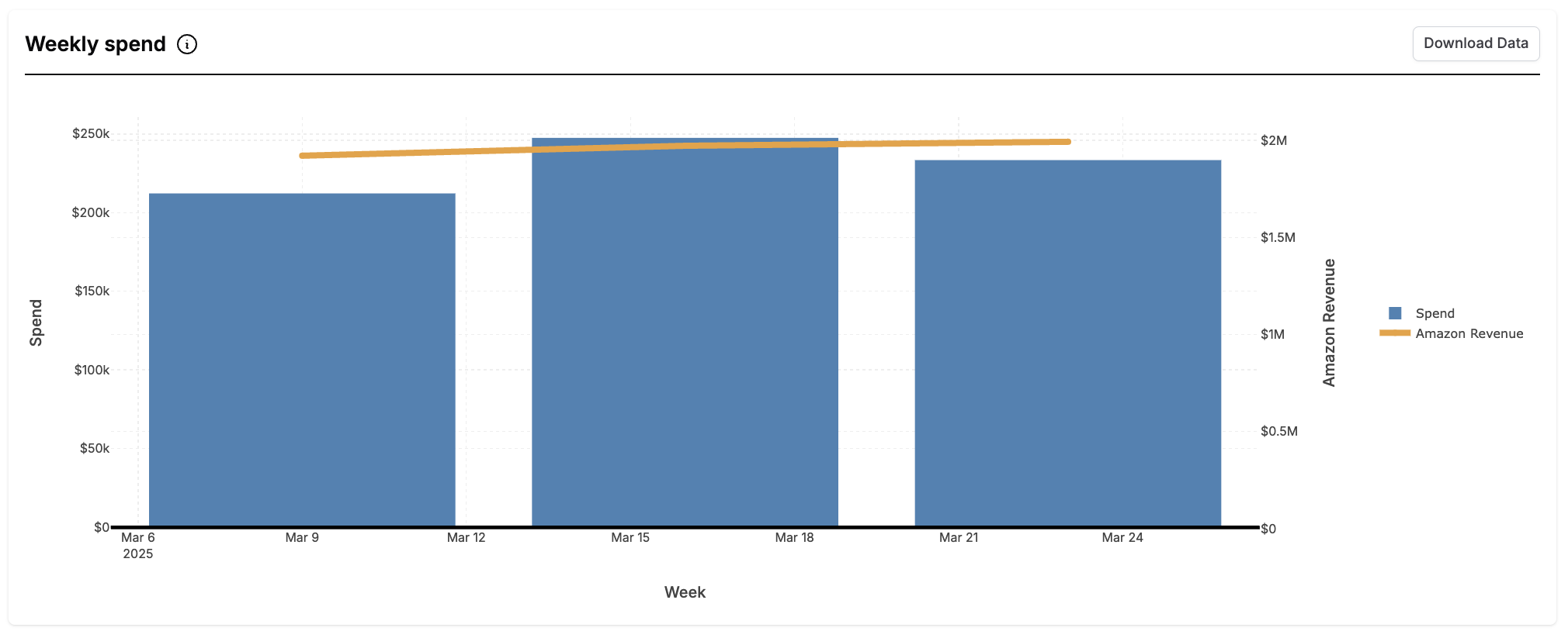
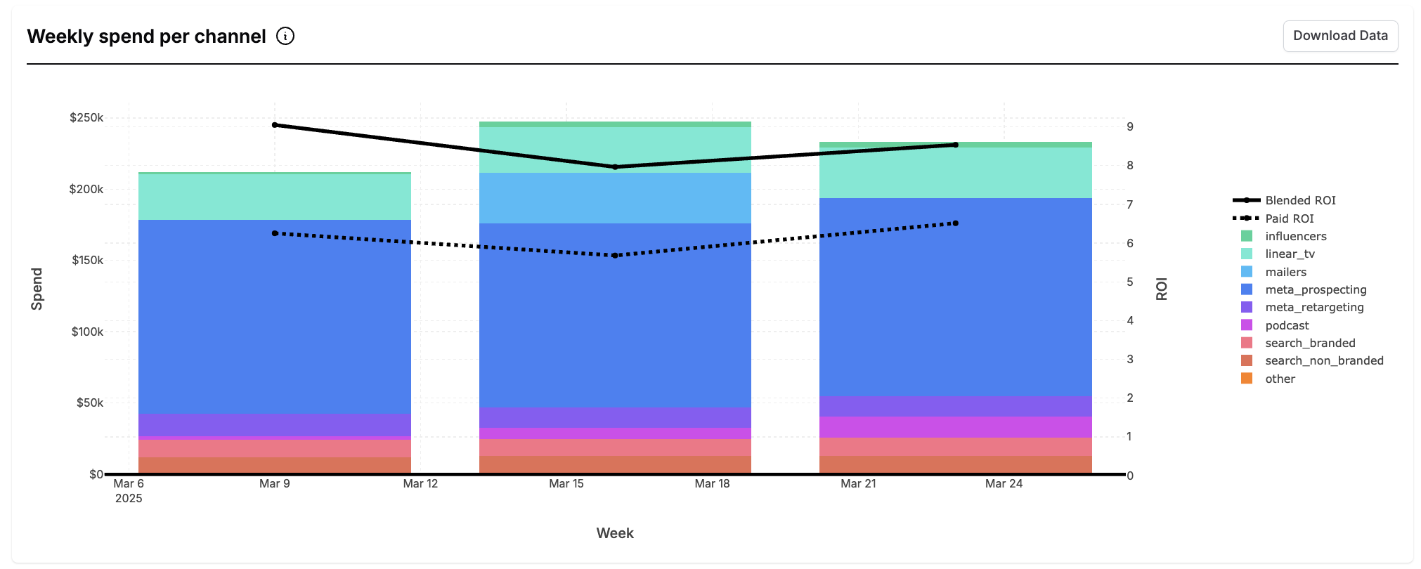
Spend summary
The spend summary summarizes how much money was spent in each marketing channel in your model over a given time period. This report can be useful to compare the Recast model to internal systems. The time period for which the report is available will be shown in the dashboard.
What inputs are needed for the report?
-
Date range
-
Monthly or weekly view selection
This report contains two graphs. The first shows the
weekly or monthly spend and KPI. Use this graph to find patterns in spend and your KPI. The second graph shows the total spend each week or month broken down by the amount spent in each channel. This graph shows both the blended and paid ROI over the reporting period.
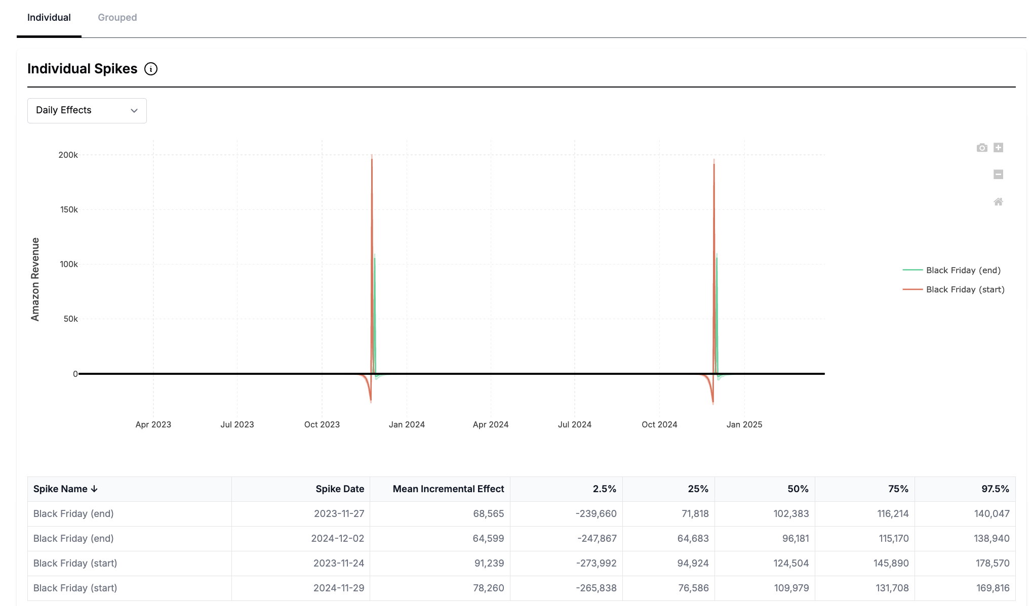
Spike detail summary
The spike detail summary shows how different spikes (promotions, holidays, etc) affect your KPI on a day-to-day basis. It can be helpful in seeing the pull-forward and pull-back effect of promotional events.
This report contains both individual and grouped views of your spikes. Grouped spikes group each instance of a promotion eg. Black Friday 2022 and 2023 and is measured by the impact on your KPI in number of days from the spike center.
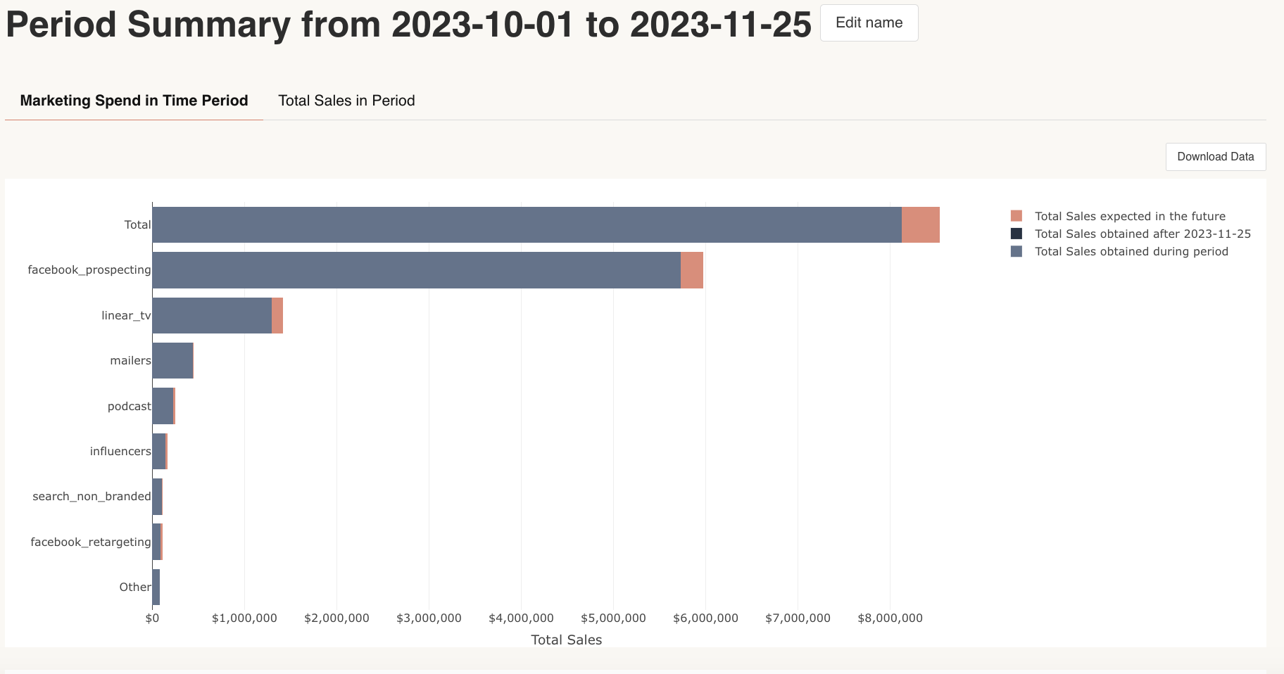
Period summary
The period summary provides a comprehensive report of a specified time period. It shows how much of your KPI was driven by spend in the time period vs. spend prior the time period. It also estimates how your future returns will be influenced by spend in the time period.
What inputs are needed for the report?
The only inputs needed for this report is setting the start date and end date for the reporting period.
What can you review when the report is run?
When run, you can review marketing spend in the time period. This is broken down by total KPI expected in the future from marketing spend in this period, KPI obtained after the date of report ran and the KPI obtained during the period.
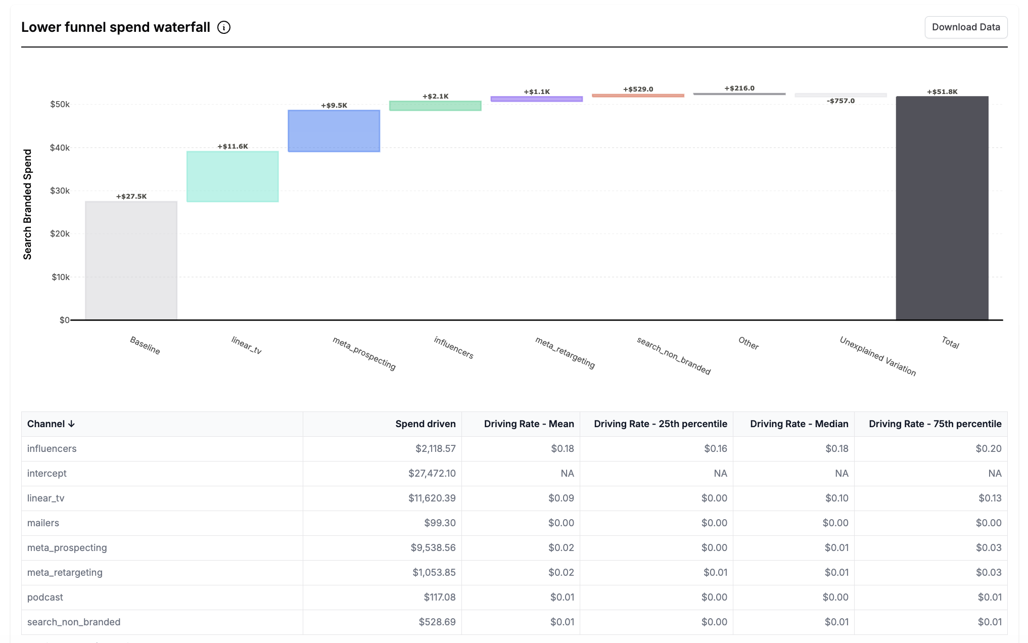
Lower funnel details
The lower funnel details report shows the rate at which upper funnel channels drove spend into your lower funnel channels. For each of your lower funnel channels, the graph in this report shows a waterfall breakdown of how much spend each of your upper funnel channels drove into that lower funnel channel. Hover over the chart to see the % of total spend in the lower funnel channel driven by each upper funnel channel.
The report also contains a table with each of the upper funnel channels and the spend each of them drove in your lower funnel, the rate at which upper funnel channels drove spend into your lower funnel and the effect (in KPI terms) driven by spend in each upper funnel channel in the selected lower funnel channel.
To learn more about lower funnel channels visit Lower Funnel Channels.
Time Period Comparison
The time period comparison report shows the comparison between the model’s estimates over two time periods. This report is useful to compare the before and after of any model configuration changes, tests or optimizations to see how changes to your plan or model impacted your estimates.
To use, simply fill in the start date and end date for each of the two time periods and run the report.
Note that the ‘previous period’ needs to be strictly before the ‘current’ period. This means that the end date for the ‘previous period’ needs to fall before the ‘current’ period.
The resulting report compares the ROI/CPA, mROI/mCPA, In period effect, baseline and total outcome for the entire model over the two time periods. It also shows the % change in each of these estimates between the time periods.
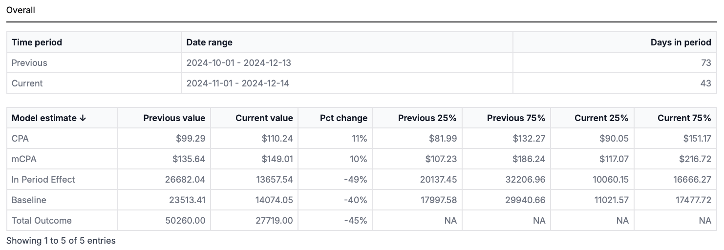
It also displays a graph comparing the ROI/CPA, mROI/mCPA, In period effect, and spend for each channel between the two time periods. In the download associated with the graph, you can find the estimates for each channel during each time period as well as the percentage change between the time periods and the 25th and 75th percentile confidence intervals.
In CPA models this graphs the conversions per thousand spent (higher is better).
The semantic dates for recurring Time Period Comparison Reports allow you to select the ‘previous period’ as ‘last month/quarter/year to date’.
This is built to be used in conjunction with the ‘month/quarter/year to date selector’ and compares the same number of days during the previous month/quarter/year to the current month/quarter/year.
Upper funnel details
The upper funnel details report shows how your selected upper funnel channel drives ROI to lower funnel channels. It compares the direct effect of the upper funnel channel with the total effect across time to show how much of the total ROI was from upper funnel channels directly and how much was from lower funnel channels. To use, select the time period for which to view the report and the channels you want to include.
For each channel selected, the report contains a graph of the Total ROI and the Direct ROI so you can see the proportion of Total ROI that is directly driven by your upper funnel channel over the reporting period. The difference between Total ROI and Direct ROI is the Indirect ROI from lower funnel channels at each point during the reporting period.
This report also contains a table of the lower funnel channels along with the per channel ROI and spend driven by each channel.
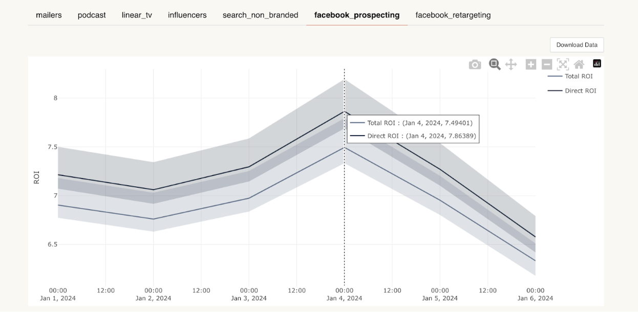
Questions this report can answer
Q. How much of my total channel ROI is driven by lower funnel channels at various points during the reporting period?
A. The difference between the Total ROI and the Direct ROI is the Indirect ROI. The indirect ROI is the measure of how much of your Total ROI is driven by your lower funnel channel
Q. How has the proportion of Total ROI driven by direct ROI from upper funnel channels changed over time?
A. Look at the change in the gap between the Total ROI and the Direct ROI to see the changing proportion over time.
Q. Which upper funnel channels drive the most spend into my lower funnel channels?
A. If the difference between your Total ROI and the Direct ROI is large, this upper funnel channel drives a lot of spend and ROI in your lower funnel
Context summary
The Context Summary report is a useful tool for companies who have models with additional factors affecting their marketing outcomes. For example, if you find that after a price change or new offer, your sales are performing differently, our new model will be able to measure these changes. The context summary report is where you can see the effects of these contextual variables on your sales and marketing spend.
This report is only included in some models where contextual variables impact the target outcome
To use the Context Summary Report:
-
Navigate to the Reporter page
-
Select “Context Summary” as the report type and input the date range for which you want the report to run
-
The resulting report gives information on the Effect of Contextual Metrics, the Variable over Time and the Effect over Time
Contextual variables must be pre-configured in your Recast model before the report will be available
Interpreting the Graphs
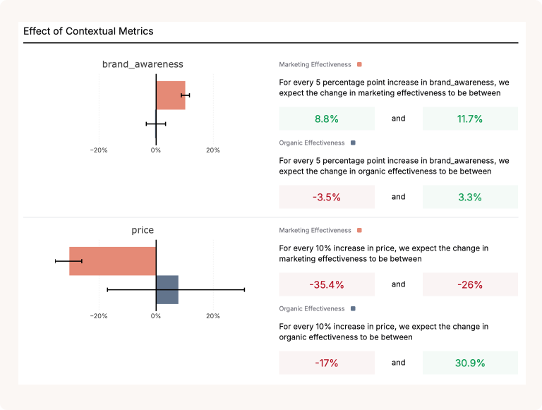
Effect of Contextual Metrics
The first graph in this report is the Effect of Contextual Metrics graph. For each of your contextual metrics, this tells you how much your marketing effectiveness will change with a change in your context variables.
For example, the graph below tells us that a 5 point increase in brand awareness is expected to lead to an increase in marketing effectiveness between 8.8%-11.7%.
For each contextual metric, you can see the impact of changes on both the paid and baseline effectiveness.
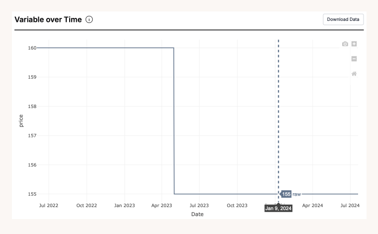
Variable Over Time
The next graph is the variable over time graph. This tells us how much your contextual metric has changed over time. In the graph below, we can see that the price decreased in May 2023 from $160 to $155. You can use this information to provide context to any changes you see during this time in your marketing effectiveness.
Use the hoverover to find the value of your context variable on a specific date.
Effect Over Time
The final graph is the effect over time graph. This shows us the effect of the contextual metric on marketing effectiveness over time.
In the graph below you can see that when there was a price change in May 2023, the organic effectiveness fell from 103% to 100%.
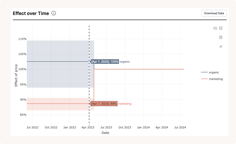
To use the two graphs together:
-
Identify the time period when there was a change in the contextual metric using the first graph.
-
Look at the same time period in the second graph to see the the effect of the change on marketing effectiveness.
In-sample model fit
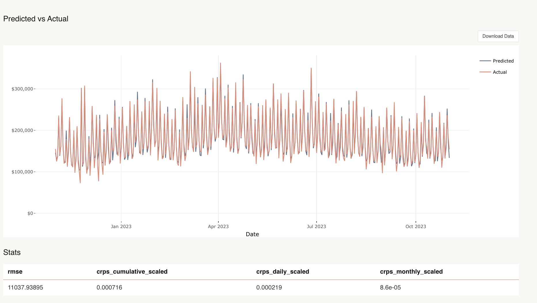
What is this report for?
This report shows the in-sample error of the model, and how well the model is fitting to the data that it observes. When run, you also receive more detailed stats, and can download these as a summary from the report. This can be used for evaluating the model’s fit to data it has been trained on for diagnostic purposes.
This can then be contrasted to out of sample testing, shown in the backtest tab in the Insights dashboard, where the model’s forecast is evaluated on how well it can predict performance from data it has not been trained on.
What inputs are needed for the report?
All that is needed is the start date and send date of the reporting period to run this report.
What can you review when the report is run?
You can review the predicted in-sample model fit vs the actuals. You also receive more detailed stats, and can download these as a summary from the report.
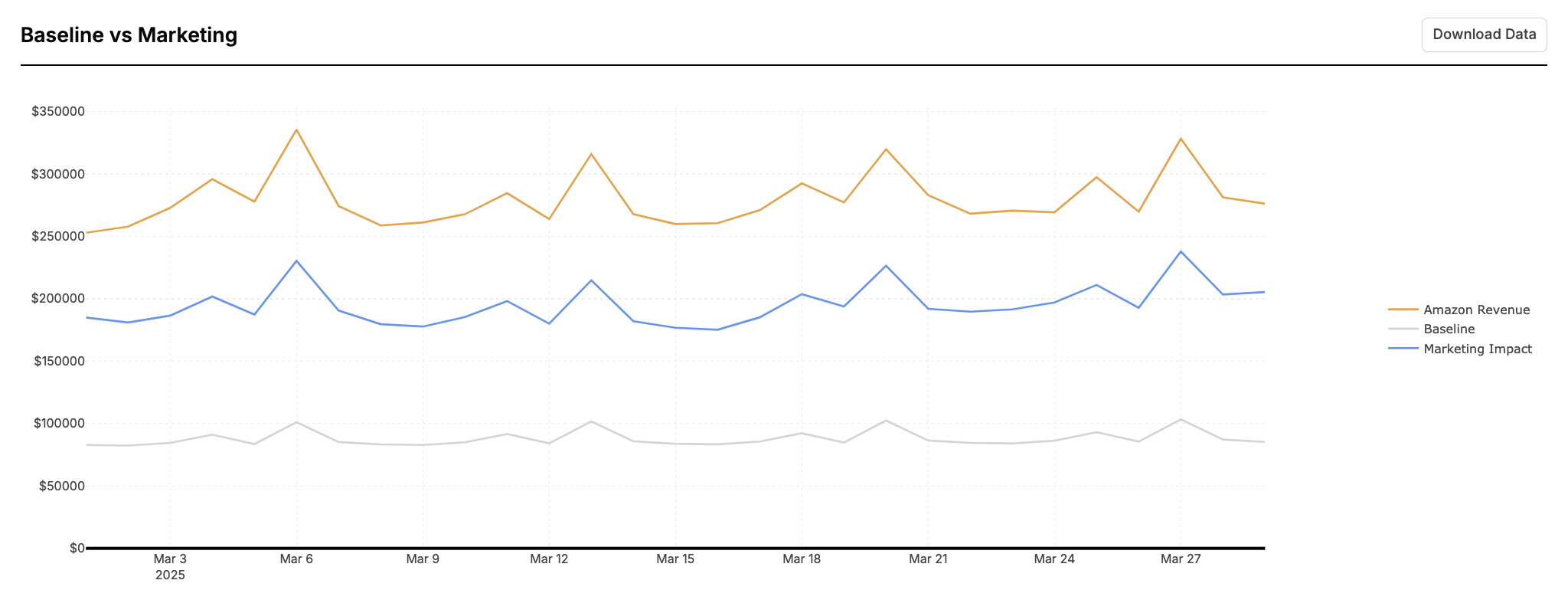
Marketing vs Baseline
What is this report for?
This report enables you to review the share of your total KPI driven by your marketing efforts vs how much is driven by organic sales. It shows your total KPI, the amount of KPI driven by organic and the amount driven by organic over time. This can be useful to identify business trends, seasonality, and helps answer the question, ‘how much does my marketing impact my KPI and how much does my intercept contribute to my modeled KPI?’.
What inputs are needed for the report?
All that is needed to run this report is date parameters.
What can you review when the report is run?
For the parameters run, you can review the contribution of both the baseline and the marketing impact to your KPI.
Both the total baseline and total marketing impact are in-sample model estimates. How closely they sum to the total KPI will depend on the in sample fit. If the in sample fit has sizable errors, the marketing and baseline may add to significantly more or less than the KPI on a given day. You can assess the in-sample fit using the In-Sample Model Fit report described above.
Channel Uncertainty Drivers Report
This report produces two charts and is intended as a diagnostic tool for understanding why there may be a wider confidence interval for a channel. This may be due to lack of spend, or correlation with another channel, spikes or the intercept.
-
A scatter plot of lack of signal against total spend. This enables us to decompose the question of where variation is coming from - either correlation with other channels vs low spend.
-
A waterfall chart that decomposes the uncertainty in impact in a given channel to two sources (either correlation with other channels e.g. the intercept or lack of signal). The bars are sorted in decreasing order of spend into those channels, and the percentage represents the proportion of the model's uncertainty around the channel read that is brought about by the item in the bar. Lack of Signal is a significant contributor whenever spend in the channel is small.
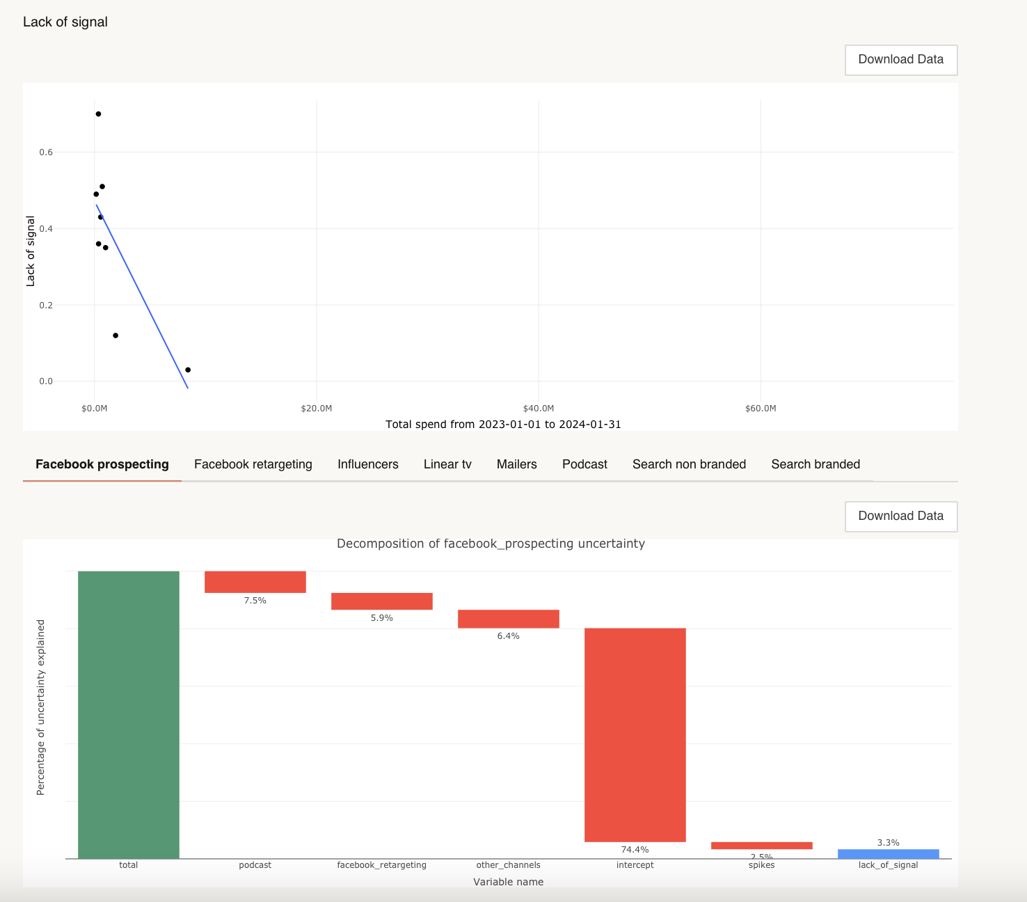
You can read more about the technical details at this link.
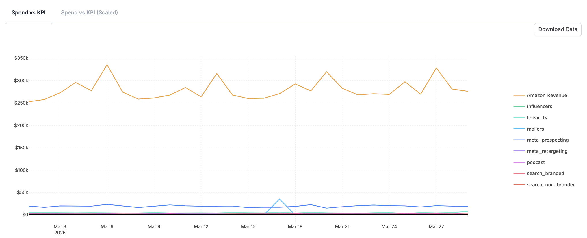
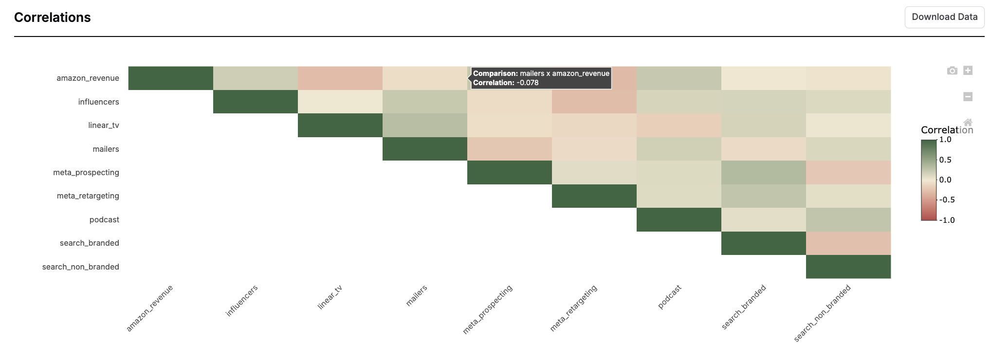
Daily Spend vs KPI
This report enables you to compare spend patterns over time, and review your marketing spend against your modeled KPI. This helps to see the trend of your marketing spend vs how your modeled KPI is performing.
You can also run this report as a diagnostic tool, in order to identify correlations between your channels configured in the model.
We would therefore recommend running this report to better understand the patterns the model is seeing in the data, or to identify pairs of channels that are highly correlated in order to prioritize testing.
What inputs are needed for the report?
You select to review specific channels in your model, or multiple channels. The only other input is inputting the date parameters.
What can you review when the report is run?
When run, you can review both spend vs KPI and spend vs KPI scaled. You can also review correlations across channels.
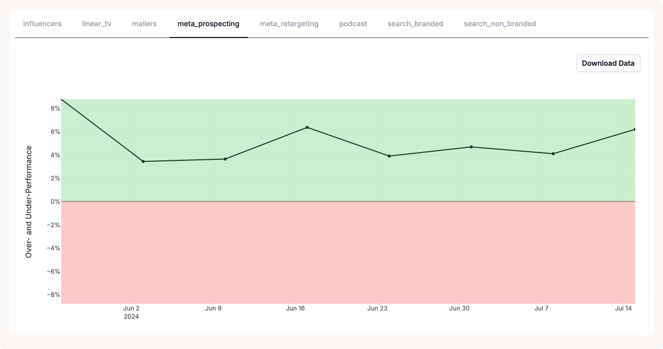
Share of Spend vs Share of Effect
The share of spend vs share of effect report plots the % of impact driven by each channel minus the % the spend into each channel over time.
Share of spend is calculated by dividing the channel's spend by the total spend in the time period.
Share of effect is calculated by dividing the estimated impact of the spend by the estimated impact of all other channels.
When channels are ‘in the green’ they have a larger share of effect than a share of spend. At these points, the channel represents a smaller portion of the total spend compared with the amount of KPI it is driving. When a channel is ‘in the green’, it is considered to be over performing.
When channels are ‘in the red’ they have a larger share of spend than a share of effect. At these points, the channel represents a larger portion of the total spend compared with the amount of KPI it is driving. When a channel is ‘in the red’ it is considered to be under performing.
What inputs are needed for this report?
Select the total date range and the time granularity with which you would like to view the channel’s performance over time.
What can you review when the report is run?
View every channel’s performance over time for the selected time period.
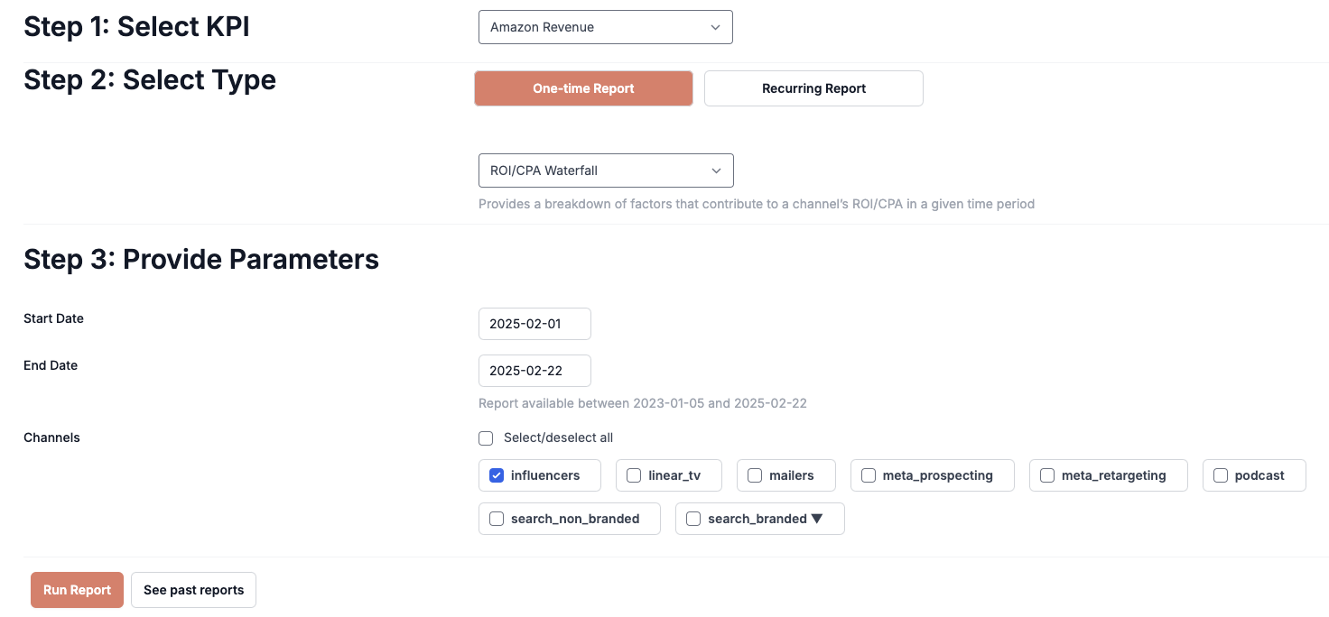
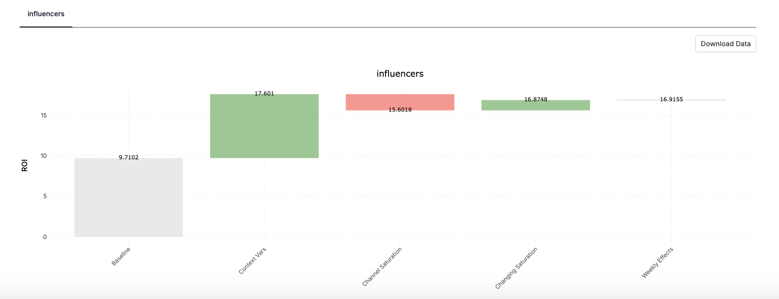
ROI/CPA Waterfall Report
The ROI/CPA waterfall report decomposes your ROI/CPA into the factors that are driving it.
When Recast first estimates your ROI it estimates a baseline and then layers contextual variables, saturation and seasonal effects to get the a more accurate ROI estimate.
This report shows how much your ROI is impacted by each of these factors.
Inputs
-
Start Date and End Date: Select the time period over which you would like to analyze your ROI/CPA.
-
Channel Selection: Select the channels to include in your report.
Outputs
-
Baseline ROI: This is the initial ROI estimated by Recast without any contextual, saturation or seasonal effects.
-
Context Vars: This is impact of your current context variables on your ROI.
-
Channel Saturation: This is the impact of how saturated your channel is at the current level of spend on your ROI.
-
Changing Saturation: This is the impact of factors that the model may not have direct information about. Eg. competitors, campaigns, seasonal saturation etc.
-
Weekly Effects: This is the impact of the current seasonal effects on your ROI.
Use Cases
✅ Diagnosing unexpected ROI/CPA changes.
✅ Answering “Why does Recast estimate this ROI/CPA?”